Real output from HookSignals on an example package. Captured Oct 8, 2026.
Run it on your own videoThumbnail Studio on one Shorts thumbnail, plus four new concepts
The same example package, run through all three parts of Thumbnail Studio: the free feed preview, the AI review of the image and concept generation from the video idea. The review and the concepts are the tool's output, unedited.
What went in
Title
Video idea (for concepts)
Text on thumbnail
Style
What came out
The Thumbnail Studio report, as the tool returned it
In the feed
The free preview. Switch surfaces and light or dark mode; grey cards stand in for other videos.
Your channel
Home (desktop) renders your thumbnail at ~360px wide. Grey cards stand in for other videos in the feed.
Shrink test
If the idea still reads here, it reads in the feed.AI review
A vision model reads the image the way a viewer scanning the feed would.
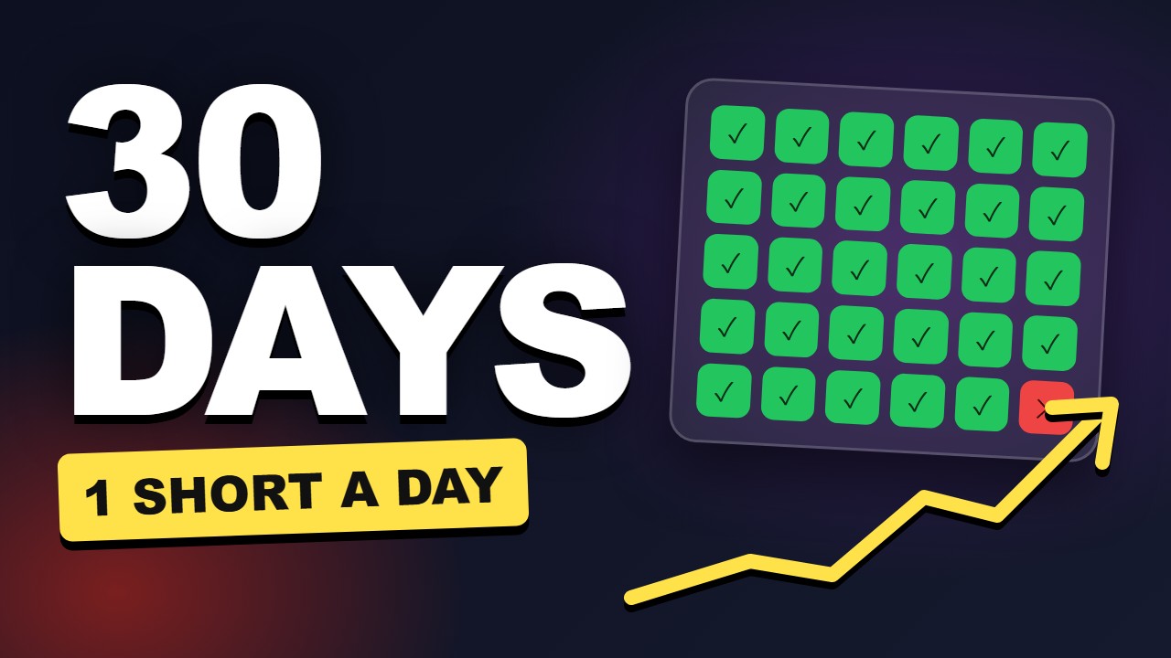
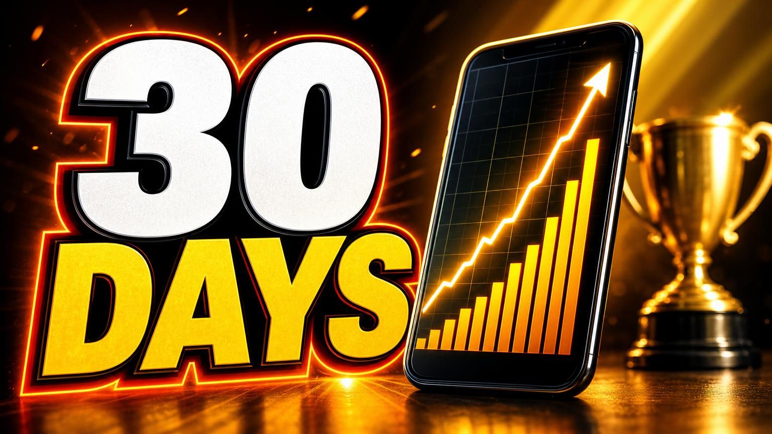
The bold "30 DAYS" text is instantly readable and the calendar graphic clearly supports the challenge concept.
AI vision read of the image. A second opinion, not a CTR prediction. To test with real viewers, upload up to three versions to Test & compare in YouTube Studio after you publish; it ranks them by watch time share.
All text is large, bold, and legible even at small sizes.
The design has a clear focus on the challenge duration and daily posting, with no distractions.
White and yellow text pop against the dark background, and the green checks stand out on the calendar.
The upward arrow and checkmarks suggest progress, but there is no human face or strong emotional cue.
The thumbnail visually summarizes the title without repeating it word-for-word.
Text we can read
5 words“30 DAYS 1 SHORT A DAY”
Eye lands on
"30 DAYS" text, left-center
Fixes, most impactful first
- 1Add a subtle glow or drop shadow to the yellow arrow to make it pop more against the background.
- 2Increase the size of the red calendar square slightly to emphasize the 'missed' or 'final' day for added intrigue.
- 3Consider adding a slight gradient or vignette to the background for extra depth.
Already working
- Text is extremely clear and readable at any size.
- Calendar and arrow visuals quickly communicate the 30-day challenge concept.
- Color contrast is excellent, making all elements stand out.
How to read this report
- Scores, issues, fixes and rewrites are an AI editor's judgement. They are a second opinion on the packaging, not a prediction of views or click-through rate.
- The view counts in this capture were read from the YouTube Data API on Oct 8, 2026. They keep moving after capture, and live checks compare against the most-viewed videos on the topic using their public view counts.
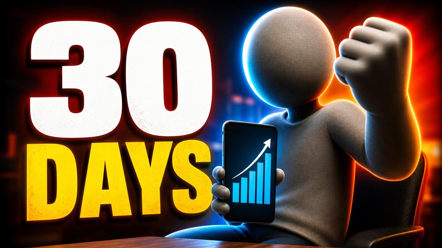
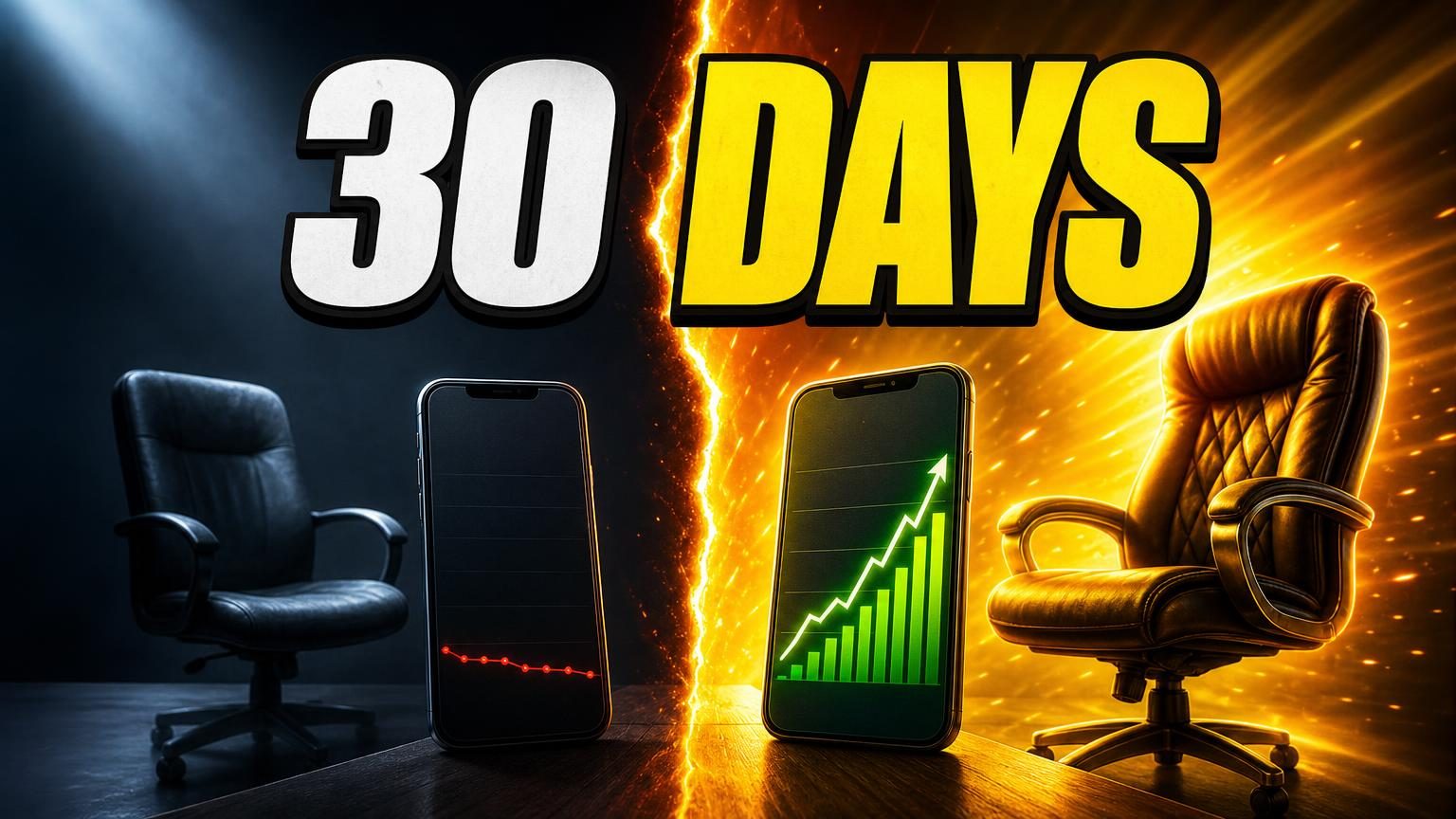
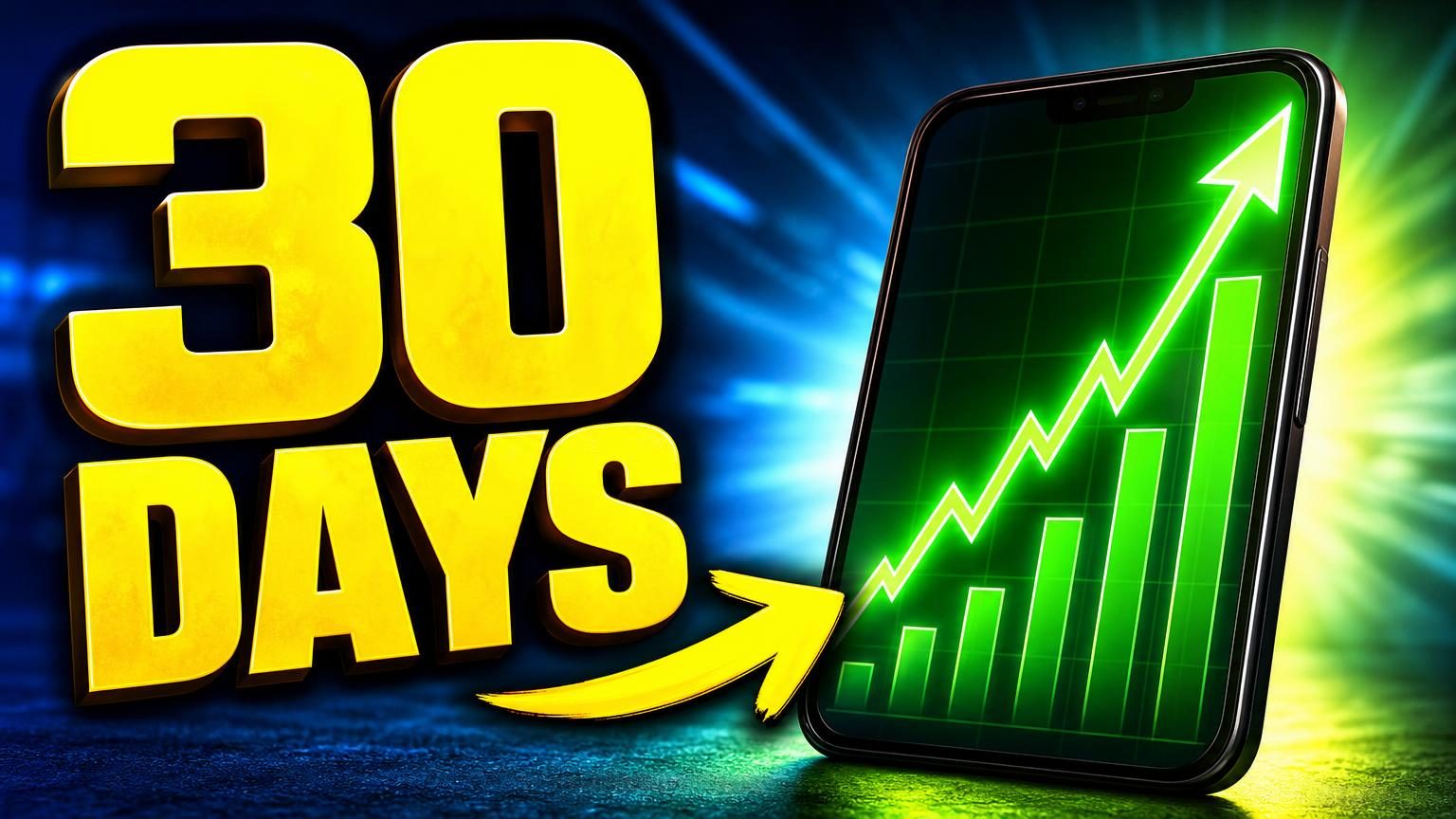
- The example package is ours, not a creator's. Its thumbnail was itself generated earlier in Thumbnail Studio.